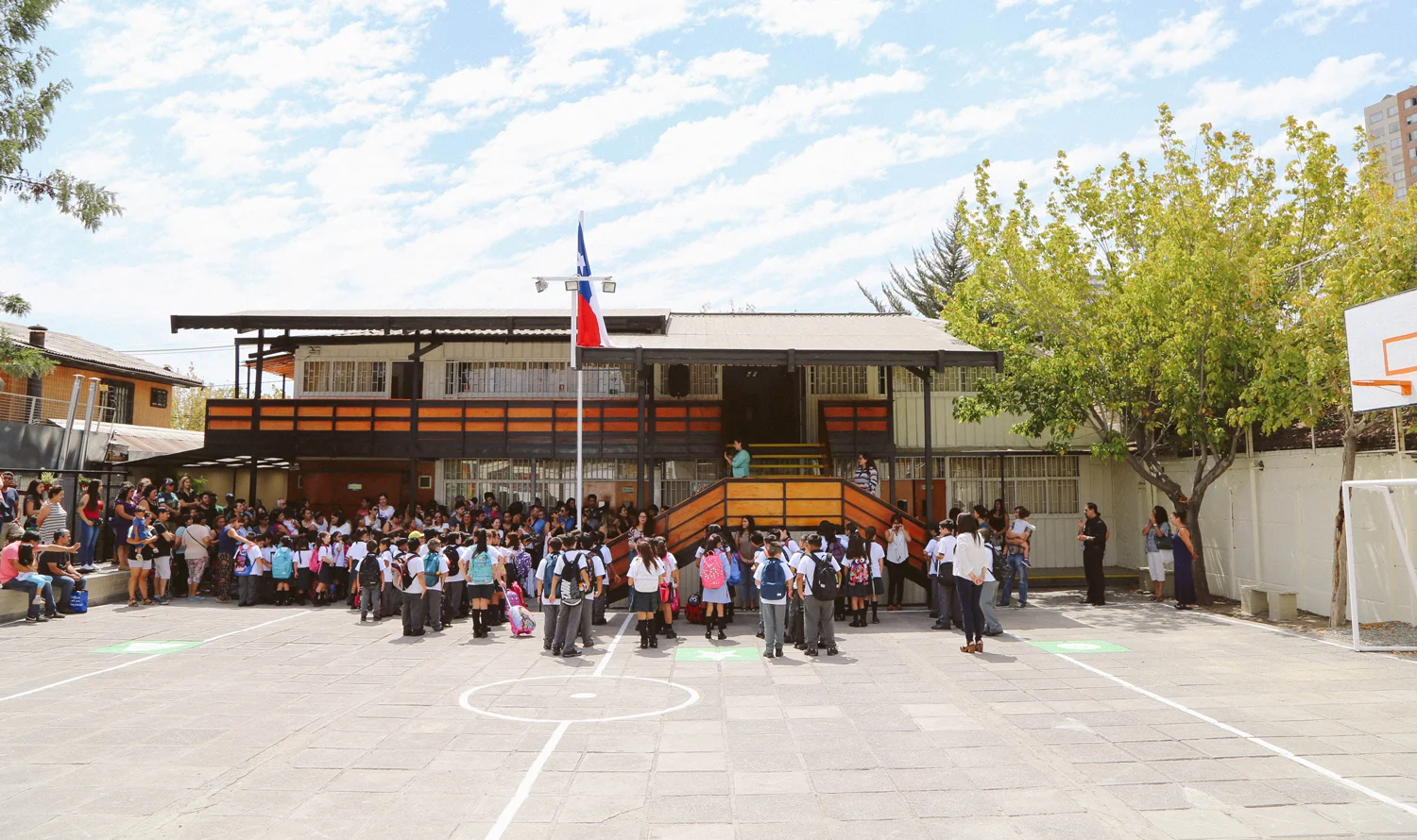
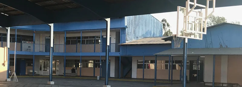
2016-2018 | Santiago, Chile
Corporative and Infrastructure Development Sub-Director
work on
Management
Brand Identity
design system
Strategy
infrastructure renovation
Marketing & Advertising
Web design
In Spanish, RECH is an acronym for "Camilo Henríquez Educational Network.” Camilo Hernríquez was a Chilean priest, writer, and politician. Furthermore, he was the editor for the first Chilean newspaper as well as a founding father of the Chilean education system in the 19th century.
RECH was founded almost 40 years ago in a tiny technical school located in the town of Maipú outside Santiago, Chile. Today, it has grown to include five schools throughout the city with 3,000 students ranging in age from 3-months to 18-years-old. The network’s growth is due to their tireless effort to improve the quality of academics offered in schools.
RECH Responds: A Call-To-Action For Educational Reform And Improvements In Public Education
With educational reform in progress and structural updates in place, we felt improving public image was the natural next step. First, we focused on creating new branding that spoke to the strength and trustability of RECH. Next, we went on to customize the branding for each individual school within the network. Then, we incorporated the RECH logo in all branding for these individual schools, which fall under the RECH umbrella, as a sign of inclusion and endorsement. So, for example, a kindergarten called Pangui has it’s own unique branding, and includes the logo for RECH as a seal of approval.
Check out Pangui’s Project →
The New Branding Honored Original Attributes, Improved Upon Quality, And Considered Wide-Rage Application.
Camilo Henríquez Charter School
This is the flagship school. It was the original institution, and lends its name to the network at large. The image of founder Camilo Henríquez has always been used as an identifying logo, and we wanted to keep it. So, we simply improved the quality of the illustration and added the founding date to honor its history.
Before
AFTER
Mauricio Rugendas Charter School
This is the second oldest institution in the RECH network. Its logo is highly recognized in the neighborhood it serves. As a result, we chose to only clean and refresh the elements. Mauricio Rugendas was a German painter in Chile during the 19th century. His work is an enduring testament of the country’s early beginnings. The new typeface we chose is a romantic art deco font, which pays tribute to the country’s first schools.
BEFORE
AFTER
Salvador Dalí Charter School
This is a newer addition to the RECH network. As a young institution, with no established branding, it provided an opportunity to design something new. The existing logo had no identifiable reference to the Spanish painter, so the idea was to create a “portrait” that connected the school community to its namesake.
before
after
Bicentenario Pre-university School
Bicentenario is a pre-university prep school for students in their last year before university. Here students prepare for their entrance exam, which takes place once a year and tests on six areas of study: Mathematics, Language, History, Chemistry, Physics, and Biology. These scholastic disciplines are represented in the new branding by an icon that changes to correspond with a given subject.
before
after
Upgrading Infrastructure, too.


In my role of innovation for RECH, I aided a new program to renovate facilities. In the pictures, you can see an upgraded classroom in Camilo Henriquez as well as a completely restored restroom in Salvador Dalí School. This is a part of a much larger plan to improve services and experiences throughout all buildings in the network, which will continue year by year.


